''Creative minds set goals''
See Some in-depth research:
''We were required to create a research page to show our further understanding of the media industry and what we've collectively developed about particular magazines which we see on a everyday basis. So, here is an in-depth version of all my research tasks in one section''.
textual analysis:
In this task which kick starts the research stage is to do textual analysis- the main purpose of textual analysis is to discuss the connotations to each element contained in images that are around all magazines, with all points being linked back to the musical genre. In this we used these key terminology to determine why photos in magazines are the way they are, these are : Denotation. Mise-en-Scene (Costume + Props + Setting + NVC + Lighting), Typography (Conventions – Masthead + cover-lines + choice of Fonts + Colour Scheme) and Target Audience:

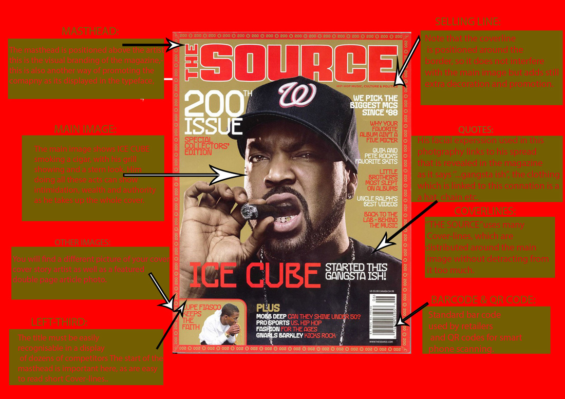
FRONT PAGE:#1
DENOTATIONS: The first aspect that the intended audience notices is a picture of various artists in different positions scattering the magazine front cover to represent their music genre –rap/underground music. The background is plain white so that the various artist standout more on the front cover and so that the readers don't get distracted by the background and focus on the artist on the page. The white background and the artist make a contrast as white is usually considered to be the colour of perfection. White means safety, purity, and cleanliness. As opposed to black, white usually has a positive connotation-isn’t anything like the artists music as they are all more hard core artists, with harsh-rough music. The colour choice of the headlines and the subheading are red, white and blue as these colours are very appealing and attractive, they also hit the eye when people notice them in the stores and will want to purchase this magazine.
COSTUMES: The clothing they are all wearing is white which can represent wealth, which connotes the idea of rebellion which works well with this genre of music. All of the artists are covered not actually showing their body which shows that not always sex sells as these people are talented without the typical look of showing of your body and money but generally having fun in general clothing. Also, I noticed they are all wearing wealthy jewelry which to the rap and hip hop industry is a demand as all of them have to have that image – the jewelry overall is varied for each artist as all of them are at least showing one piece.
MISE-EN-SCENE
NVC: The artists are individually showing there personality by posing differently. The different poses they show are happy, mad, aggressive, anti-social and general facial expressions they make which helped them build their brand. For example: Kodak black which is in the bottom right corner is smiling but he’s famously known for his teeth which are completed filled with grills which he’ll always be noticed and remembered for having.
SETTING: The photo is set in a studio which doesn’t have much meaning however the colour in the background is light to bring out the different artists without over doing the front cover as they take up majority of the setting. The generally setting is very simplistic so that people don’t get off guarded but recognize what they are featuring this issue of the magazine.
LIGHTING: The lighting in this magazine is very visual and bright to show all the different artists.
TYPOGRAPHY: Firstly, the magazine is trying to get across to the audience that these artist are the newest which are taking over the music industry currently- by in which they did that by mentioning that they are the new wave of 2016 in a weird, unusual font which looks similar to graffiti .The ‘’XXL’’ masthead is very distinctive: white with a red outline which catches its intended audience’s attention as its in big bold font.
TARGET AUDIENCE: Considering all the comments made about this magazine by my impression the intended audience is 16-30 is suggested to be the intended audience as to recent generations these artist have been slowly but unexpectedly risen to fame as they are listened to people between numerous but mainly this age group mentioned before. Also, the front cover is quite mature yet not overly mature such as modelling magazines eg: VOGUE etc. another thing, would be that the writing on the front cover isn't overly professionalized and has quite a basic text type which all people would read for a quick entertainment.

FRONT COVER:#2
DENOTATIONS: The first thing readers notice is the jewelry he’s wearing or his facial expressions as those are things the photographs based the image on – his facial expressions could represent his personality and his current mood in his career and life are happy and settled.
COSTUMES: The outfit in which Chris Brown is wearing is a basic jumper which doesn’t seem to show much of his personality or wealth as it usually would in ‘’VIBE’’ this could show that he doesn’t need to explain his wealth as he’s known for everything he has. However, because he’s wearing a lot of pieces of jewelry his wealth is shown there.
MISE-EN-SCENE:
NVC: His facial expressions shows happiness and joy as he smiles happily with his eyes closed, it does look as if he laughing historically – this could represent his joy for all his hard work and cause of his past experiences he doesn’t no longer care about people’s views and opinions on him so he’s going to enjoy life a lot more.
SETTING: The magazine shoot was shot in a studio in which I noticed as the background is plain and nothing is really going on to declare that it’s in any other location or even outside. The colour in the background can connote purity as he wants to have a fresh start with his career not having any more troubles with people or even run in’s with the law.
LIGHTING: The lighting in this magazine front cover is very bright and appealing but heavily edited as you can’t see any flaws on Chris Browns face. Infact, he gives a much like perfect deception as hes happy, rich with no flaws or problems.
TYPOGRAPHY: ‘’FREEDOM, FATHERHOOD AND THE FUTURE’’ is the small text above the subheading which explains that he’s gradually growing up and he’s got a lot more going on in his life now that he is a father, he’s free from the law as he’s usually clashing with the law and the fact his brand is growing even further than it ever has before because he’s got more music, more art pieces and his clothing brand is finally branching properly providing everything he wants his fans and audiences to wear.
TARGET AUDIENCE: Although, nothing is really shown on the front cover to really declare an audience the type of text type used is very basic which people of all ages can read. However, the artist is very mature and has a more mature audience so the age range I’d say this magazines intended audience would be 16-35 as they would relate to more what he has to say and his audience is usually in that age range. Also, nothing on the magazine is inappropriate therefore really anybody can read it.

DOUBLE PAGE:#1
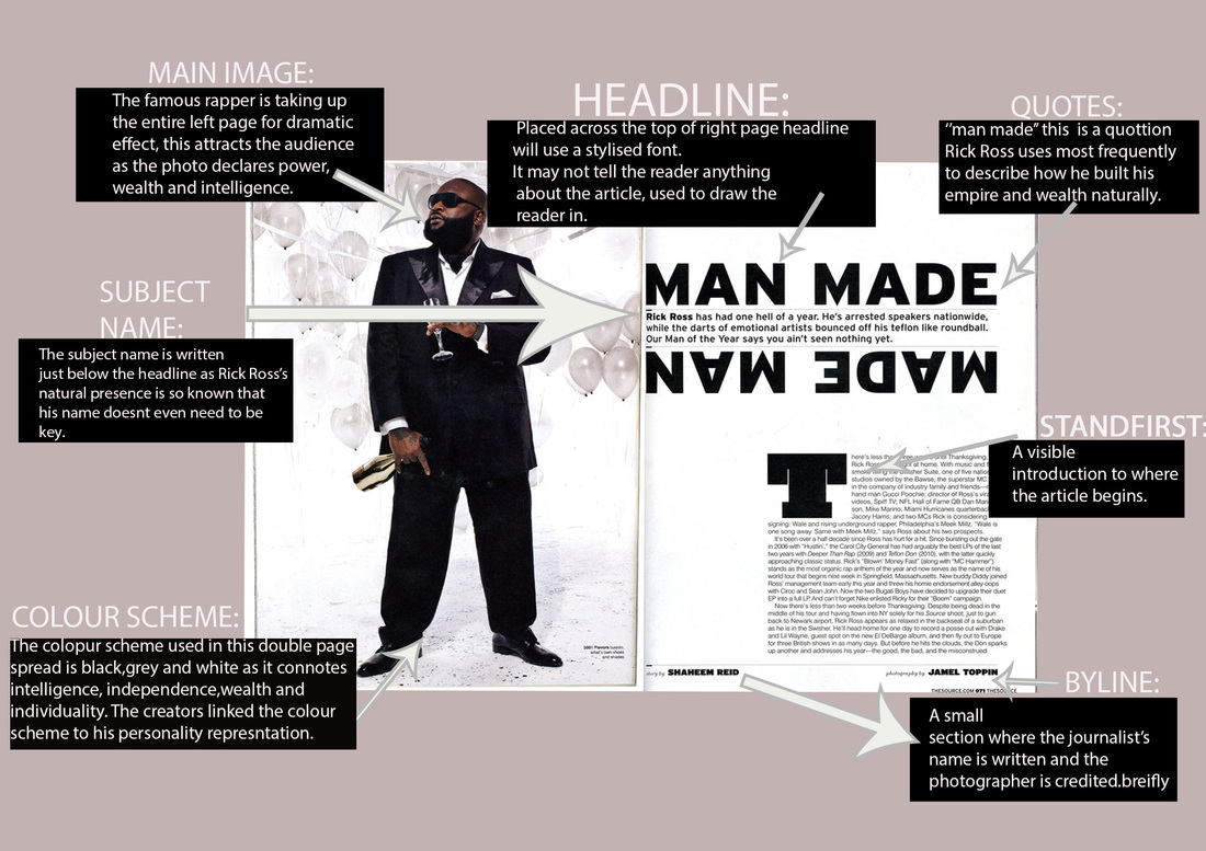
DENOTATIONS: The image on the right consists of a artist/rapper/songwriter Drake. This double page spread is based on the colours white, blue and brown, with a typical base background of white. It is a medium shot and he is staring blankly into the camera He is doing a specific pose to show his authority and commandment or to show a personal connection with the reader. Drake is looking directly at the camera, this suggests that he is a confident man.
COSTUMES: Drake is wearing a simple blue shirt with a white vest top inside, he has on dark blue jeans, because of the shot, his shoes are not in sight and aren’t even needed to be seen as his whole presence shows authority and wealth. He is also wearing a gold watch with a matching necklace. His costume show his independence when it comes to his fashion, an inference can be made that fashion isn’t something Drake focuses on, hence why he hasn’t put in a lot of effort to wear astonishing clothing. Drake usually has a very much ‘’wealthy’’ clothing which he always wears so often that it looks normal and casual for him.
mise-en-scene:
NVC: The facial experssions Drake is using is very straight and determined as he's in a straight making money kind of business which is him constantly releasing music, clothing. His hands are placed together an inference can be made that he is indicating that he is a closed book. The way he is sitting shows authority.
LIGHTING: The lighting is clear and focuses on the artist as he is the main attraction for this article.
SETTING:The setting is a plain white background, a red seat can be visibility seen as it isn’t important yet it connotes independence and self-interest as he doesn’t need anybody, anything or any piece of furniture to determine is wealth and livelihood. The plain background allows drake to be the main focus, and it also allows him to stand out more than anything else.
TYPOGRAPHY: The title of this double page is written in a bold font this makes it noticeableble and recognisable so that his audiences always recognise him. The colour used is gold/brown, this colour is a very powerful colour in terms of being symbolic, it connotes with power, triumph and progression and being sophisticated, gold is something that is mainly associated with wealthy people, so by this I can infer that this story is going to be based on how amazing he has become and how much he is doing to build his brand and future.
TARGET AUDIENCE:The target audience of the magazine would be young people from the age of 16, this is targeted at them to motivate them to be better and always work hard. On the other hand, it can also be targeted at adults to motivate them to be great in what they do. The target audience are also those who enjoy R&B and rap as drake is placed in those categories of music.

DOUBLE PAGE:#2
DENOTATIONS: In this double page spread, there are two artists named Chris Brown and Rihanna who are both wearing 'street wear' they are both in a controversial article where it states they are friends with benefits whilst they're in a 'Highly publicized relationship'. In this article it shows three images which further develop about the story and the constant confusion with their relationship. The first image on the right hand side shows Chris Brown and Rihanna getting cosy with one another in a steamy photo which leaves the impression that something is going on more than they are actually commenting on. The second photo shows a heavily sexually influenced image of Rihanna which she posted onto her social media sites to show that she’s over Chris Brown and that she’s happily independent and sexy with or without a man. Lastly, the lower picture on the right hand side shows Chris Brown with another female named Karrueche being extremely intimate as she’s kissing his cheeks and him smiling happily. However, the article is implying he’s with Rihanna as well with Karrueche.
COSTUMES: As mentioned previously in the larger image on the left hand side they are both wearing white street wear as they are casually dressing as they aren’t needing to dress over the top as it isn’t clearly a significant event taking place. Chris Brown is wearing a white t-shirt along with a gold necklace along with a New York Yankees snap back paired with sunglasses. Rihanna is wearing a street wear jumper with a pair of sunglasses, gold necklace and beanie.
MISE-EN-SCENE:
NVC: In this picture, it is seen as if Rihanna and Chris Brown had their pictures taken unexpectedly, this can be seen through their costume and body language as they're wearing fairly casual clothing unlike what they’d usually be seen in when they are featured in their in music videos where they reveal more skin and branded clothing. In the first and third picture on the right side of the page it shows Chris Brown being cosy with both woman as mentioned before he’s hugging Rihanna very sexually and then he’s receiving a ‘’cheeky’’ kiss from Karrueche.
LIGHTING: The background on the main photo is dimmed however from all the photos by papazzai they make them come up much brighter as the time set seems to be the evening. Them being shown quite brightly shows that they are important and they grab people’s attention as soon as they are seen because they’ve built a brand.
SETTING: In the background, you can see a car this shows that they did not know they were going to get photographs as they look as if they weren’t expecting them and the way they dress isn’t dressed to impress, as it was probably taken by a paparazzi as they were getting out.
TYPOGRAPHY: The main colour schemes on this page is red, white, blue and black. Red connotes to danger and love which is what this article is talking about; this suggests that they have selected the colours carefully to match the topic of this article. The title 'CHRIS BROWN AND RIHANNA' have a big and bold font as they're famous artists to catch the readers eye.
TARGET AUDIENCE: The target audience for this particular magazine spread would be people aged 16-30 as its got basic typography, doesn't use much effective language and its mainly a gossip based spread which doesn't show evidence to how it can effect people but it does show interesting language which automatically grabs peoples attention.
CONVENTION DIAGRAMS:
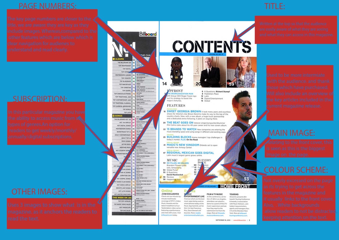
In this section of textual analysis, I will be analyzing a total of 3 magazine pages,1 front covers, 1 are double page and 1 contents page, in which I will be further exploring the key aspects of a magazine and what I visually see and the possible meaning behind the design choices. All magazine pages are of the music genre I have chosen to look at, which is pop,rap and r'n'b:
front page:
double page:
contents page:
audience PROFILING:
In this section i will be using character profiling as a way of identifying the type of people which will read my magazine as it links closer to there personality and character - this will show my imagination of what I expect the individuals to look like:

|
Name: Savannah ADEN
Age:16
Ethnicity: African/American
Occupation: Sells Assistant
Likes: Dance. Music. FOOD.
Clothing. Friends. Dislikes : Exams. Teachers. Homework. Mornings. |
Hobbies & Interest: She is currently studying dance, psychology and biology, her passion overall is dance but as a back up plan she studies science as she believes she could have the potential to be a therapist when older. At the age of 16 she successfully competed in over 300 competitions which she has won up to 256 *hurray*. The style of dance she usually competes with is contemporary, musical and jazz as her dance teacher believes that's her strongest ability. another thing, she does in my spare time is sing- growing up listening to her Grandmother singing her lullaby's she inherited the same talent in singing- this also links to her favourite genre of music as that's the type of music her Grandmother sang.
|
|
Fashion: Her sense of fashion varys as the years continue. She loves being able to stand out of a crowd yet not over do it to cause an overdraft of attention. The clothing brand she usually wears is NEXT, Forever 21 and boohoo but usually when she's training for dance she wears Nike, Footlocker and Jordans.
Music: The genre of music she usually listens to is soul, r'n'b and jazz as she feels as that music represents her love for dance and some of the circumstances she faces in life. Also, she enjoys pop music when shes ready to have a good time and enjoy herself.
|
|
|

|
Name: Damien Ryans
Age: 17
Ethnicity: Carribeanean/Barbados
Likes: Music. Rapping. Fashion. Arts.
Designing. Social Media. Sports. Dislikes: Rude people. Ignorance. Animals. Insects. |
Hobbies & Interests: Damien was born and raised in London but he's always had a huge passion in becoming successful and famous so that he doesn't end up like every other ''typical'' teenager which doesn't up doing well therefore he takes his studies thoroughly and doesn't ever get bad grades. To make extra money on the side he hosts studies to help further other A-Level students to achieve amazing grades. Damien is extremely dedicated to becoming an up and rising music rapper as he writes lyrics and regularly visits the studio in which he records his music to upload onto the internet. Other than just making music, Damien also enjoys regularly playing basketball as he's always found the sport to be extremely hard yet joyful and he's tall enough so he uses that to his advantage.
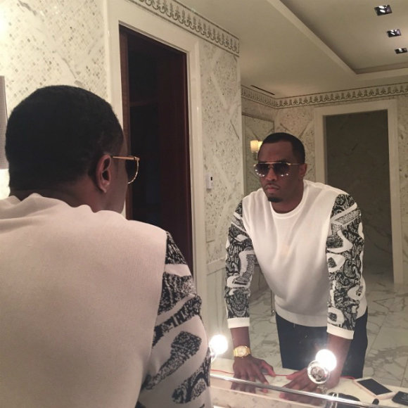
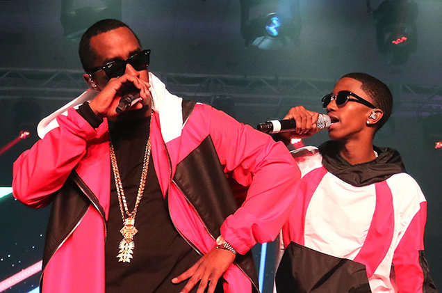
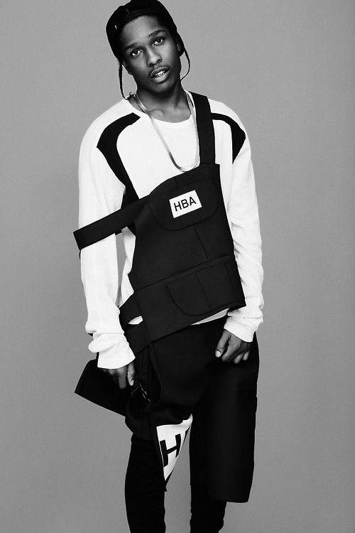
Fashion: Damien's fashion sense is heavily influenced by artists such as ''ASAP Rocky'', 'Chris Brown'' and ''P-Diddy'', he dresses much like them as he believes there style of music and clothing links well with him as he aspires to be much like them in his later future. Also, he finds there clothing to be comfortable yet it stands out as its personally unique as he mixes and changes what he wears. He's in love with various colours although he usually wears black and grey as those are currently the most popular colours worn - to add he creates his own outfits which makes his style sense much more unique.
|
|
|
Music: Damien would be classed as a music addict. He listening to all types of genre starting from rap, pop, r'n'b, grime etc as he idolising on being different to other people he doesn't have a favourite genre of music but enjoys just listening/reading lyrics and finding the meaning of songs - he loves music which tell a story or reveal a character behind the artist which isn't often shown as its hidden behind the facade they constantly show. But, if he had to pick to specific artist that he listens to without fail would be ASAP Rocky and Chris Brown as he believes they stand the most out with this newer generation of artists as they always have something new to the table. Also, he admires the older generation music as he believes it has more of a meaning and connects to him.
|
|
audience research:
Audience research was conducted in order to find out what the target audience would want from my music magazine. Through this I will have established my magazine name . I also got a general gist of what is wanted in terms of layout and colour scheme. The social media methods I'm likely to be using may be Snapchat, Whatsapp etc. Through these I was able to gather multiple completed responses for audience research:
questions i asked my audience:
front page questions:
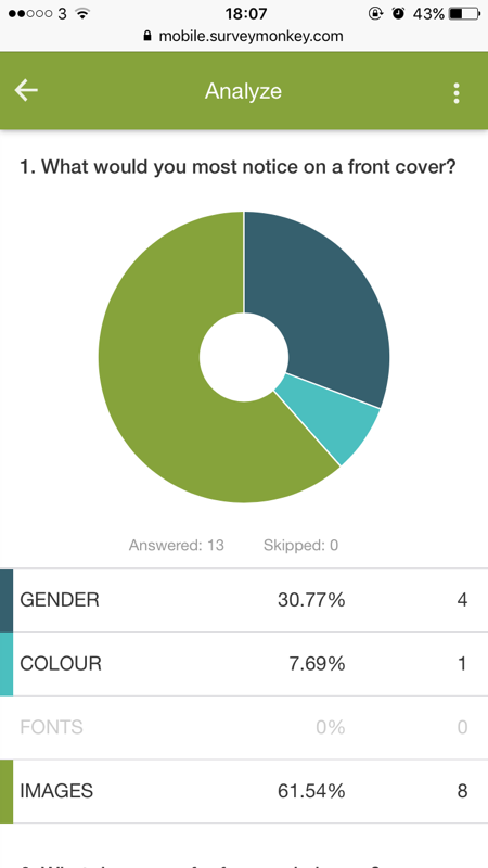
1.What attracts you to a front cover?
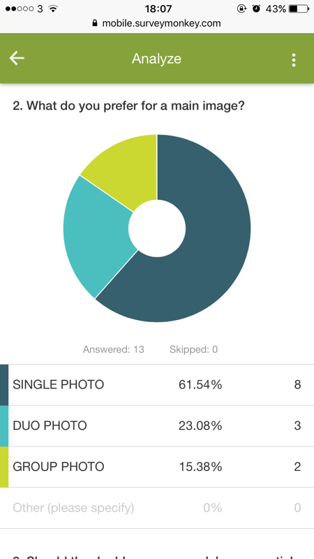
2.What do you prefer for a main image?
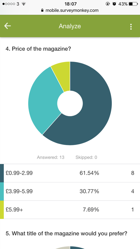
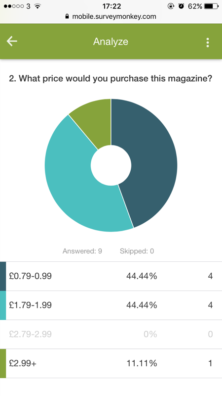
3. Price of the magazine?
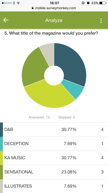
4. What title of the magazine would you prefer?
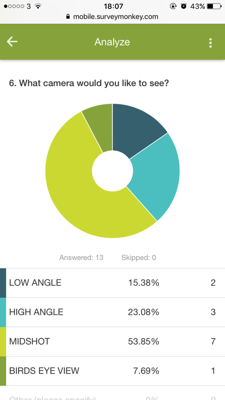
5. What camera shots would you like to see?
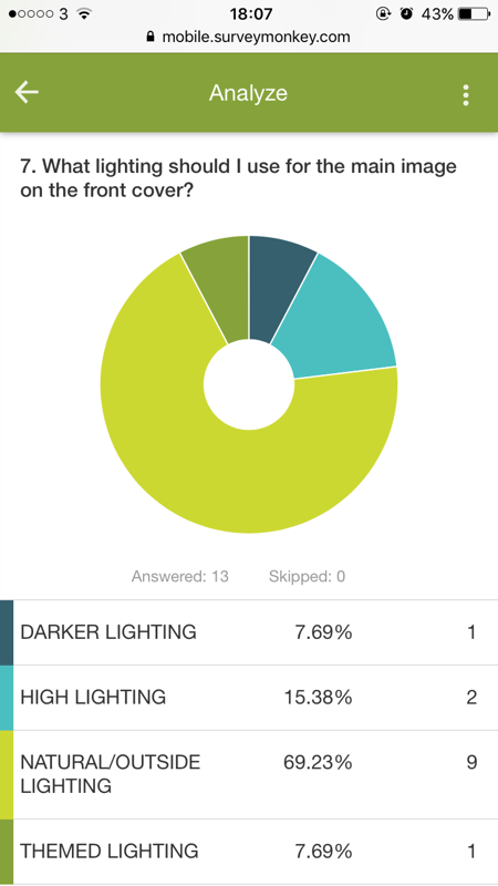
6. What lighting should I use for the main image on the front cover?
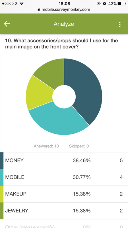
7.What accessories/props should I use for the main image on the front cover?
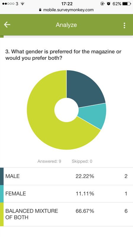
8. What gender is preferred for the magazine or would you prefer both?
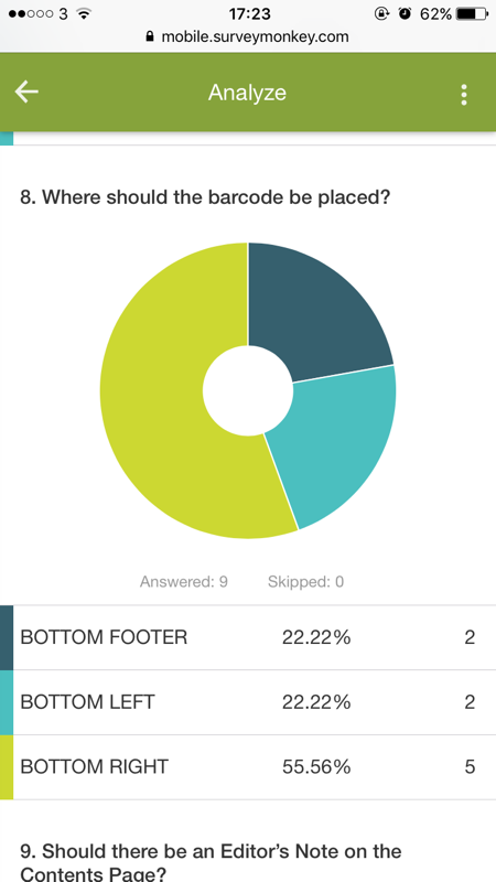
9.18. Where should the bar-code be placed?
2.What do you prefer for a main image?
3. Price of the magazine?
4. What title of the magazine would you prefer?
5. What camera shots would you like to see?
6. What lighting should I use for the main image on the front cover?
7.What accessories/props should I use for the main image on the front cover?
8. What gender is preferred for the magazine or would you prefer both?
9.18. Where should the bar-code be placed?
contents page questions
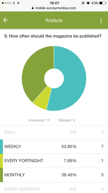
1. How often should the magazine be published?
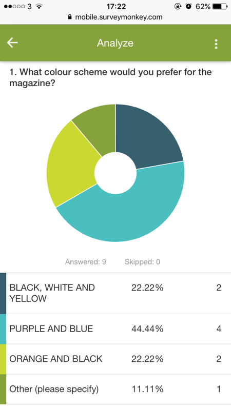
2. What colour scheme would you prefer for the magazine?
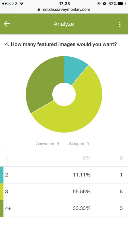
3. How many featured images would you want?
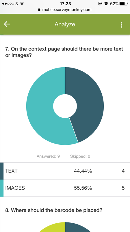
4. On the contents page should there be more text or images?
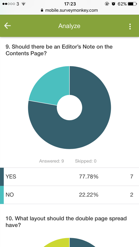
5.Should there be an Editor’s Note on the Contents Page?
2. What colour scheme would you prefer for the magazine?
3. How many featured images would you want?
4. On the contents page should there be more text or images?
5.Should there be an Editor’s Note on the Contents Page?
double-page questions:
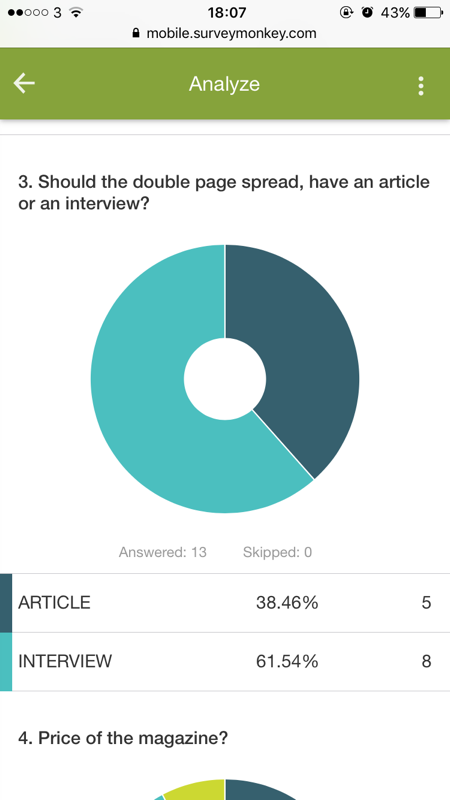
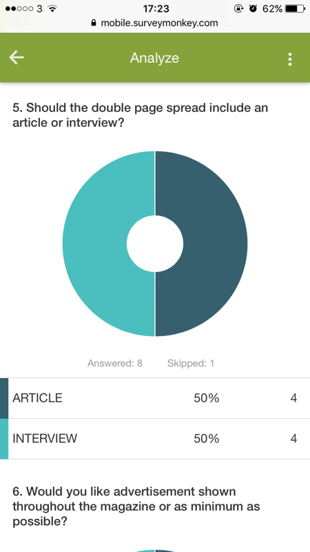
1. Should the double page spread, have an article or an interview?
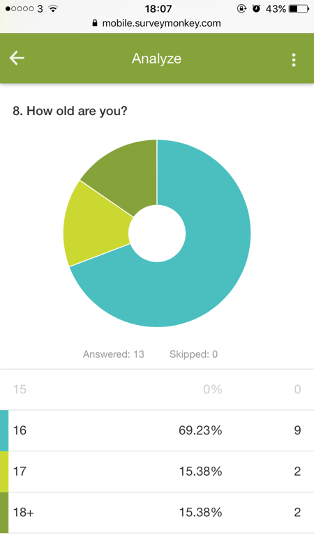
2.. How old are you?
3. Should the double page spread include an article or interview?
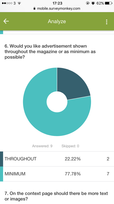
4. Would you like advertisement shown throughout the magazine or as minimum as possible?
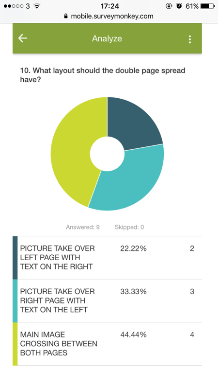
5. What layout should the double page spread have?
2.. How old are you?
3. Should the double page spread include an article or interview?
4. Would you like advertisement shown throughout the magazine or as minimum as possible?
5. What layout should the double page spread have?
QUESTIONNAIRE below:
- Part 1 of Questionnaire: https://www.surveymonkey.co.uk/r/X65Y6PL
- Part 2 of Questionnaire: https://www.surveymonkey.co.uk/r/NQVXJJK
questionnaire results/diagrams:
Part 1: Questionnaire Results
Part 2 : Questionnaire Results
video log:research
evaluation for research:
By the end of this task I had clear vision of what my magazine was going to consist of and include to make sure my target audience was fully satisfied. Using my questionnaire answers I have concluded some of the small details of my magazine, for example the font, layout, color scheme and also things like price and subscription notice. I have made sure my questionnaire was aimed at and mostly only answered by my target audience group so they can enjoy my magazine the most.
